It is said that one of the great things about photography is you never stop learning. How could you? There’s so much to learn. From lighting and exposure to posing and post-production.
I have been refining my craft. Lately, I’ve been focusing on post-production because I haven’t been shooting much lately. A consequence of being in a new city and not focusing on finding new subjects. I started using Lightroom 3 to catalog my images and decided to get a couple books to learn more about what the program can do than I could do on my own in a short time.
I think learning post production goes in stages. With all the filters and photo enhancement programs, newer photographers spend lots of time polishing turds. It takes a little while to realize fancy filters usually don’t make a crappy photograph awesome, even if you convert it to black and white. This is especially true with photos of people. Then people tend to go the other way and do a minimal amount of processing to make the image ‘true’. After the truth phase photographer learn that post-processing and filters are tools just like any others and should be used as a way to bring their vision to the image. I call it post with a purpose.
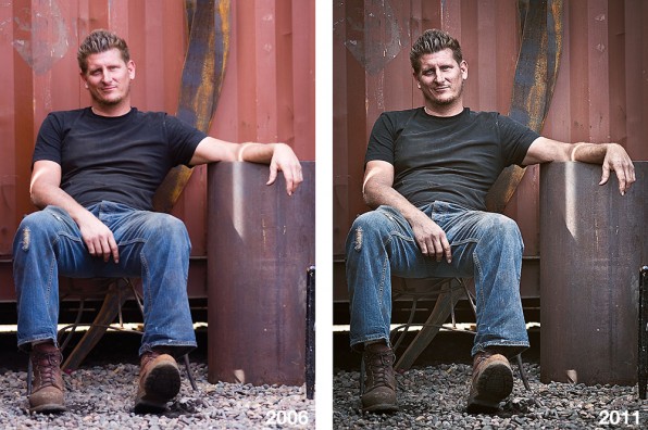
So I’ve gone back into my archives to a portrait I shot of metal sculptor Pete Deise for kontakt magazine in 2006. I went to his sculpture yard because I wanted to capture the grit of his work. If I had to do it over again, I would shoot it differently. But, I felt I captured something with the photo I did shoot of him. I just never felt like I had conveyed the true grit.
Below are two images from the exact same file shot five years ago. The one on the left is the way it was published in the magazine (I was in my ‘no processing’ phase [shudder]). It looks flat, fuzzy, no detail in the highlights and way too clean. The one on the right was just done and, I think, a vast improvement. It feels like what I wanted to convey. I used some dodging techniques to bring the detail back in the hightlights (look at the difference in the hands). There was some sharpening but the big difference is an improvement in the contrast in the midtones. The midtones were also punched up and the overall image was cooled and desaturated. Click on the image to see a larger version.
Before and after picture showing the difference in using post-processing to convey the feel.
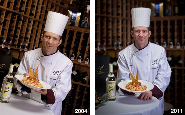
The next image was shot in 2004 for Sonik magazine. This might have been the first assignment that I shot digital. The first thing I noticed about the image on the left as it appeared on the cover of the magazine is the yellow cast. I had been shooting with Kodak SW film (SW stood for saturated-warm) so when I first started shooting digital I would warm everything up slightly and boost the saturation. The next thing I noticed was the goofy half-grin and then the distracting wine racks in the background (I’m still not sure how I feel about the tilted image). So I chose the photo I shot in the next frame. The dish is dipped a little lower to better show the food and the lopsided grin is gone.
After the color correction, the main thing I wanted to work on was putting the background in the background. I used some lens vignetting to darken the background and also worked a little on the darker midtones. Back then I didn’t think too much about depth-of-field. I just lit the scene and set the aperture at what ever the meter read; usually about f16. So I applied a lens blur and painted it in the background with the history brush in Photoshop to create a bokeh effect. If I had to do it over, I would have scrimmed the lights and shot it at f2.8 or f4. If you click you can see a larger version.
Left image the way it appeared on the cover of Sonik magazine and the on the right, a newly refined version.
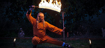
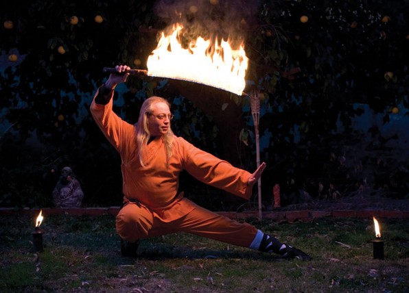
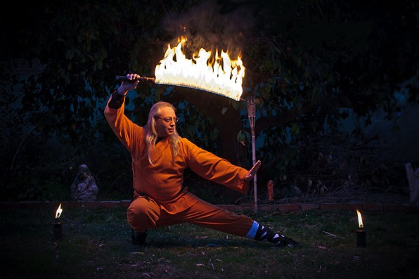
The last example was shot for Pocketmag in 2004. We were doing a story on my Tai Chi instructor and he told me about lighting his sword on fire so I had to shoot that. Much like the photo of Pete, the original lacked detail in the highlights and overall clarity. And like the chef photo, I wanted less out of the background.
The original image shot in 2004 with minimal post-processing.
There was a grapefruit tree behind him so I got rid of any distracting grapefruits and used lens vignetting to darken the edges of the background and draw the eye to the center. It aslo gives the effect that the small pool of light around him is solely from the flaming sword.
The 2011 refined version with more clarity and vibrance.
Click on these images to see the differences in the larger versions. This was a good practice for me to revisit these images to see how my eye and technique have evolved over the years. I have to admit that as comfortable as I have always been in Photoshop and on the computer, most of the refinement of my eye and technique has taken place in the last year.

